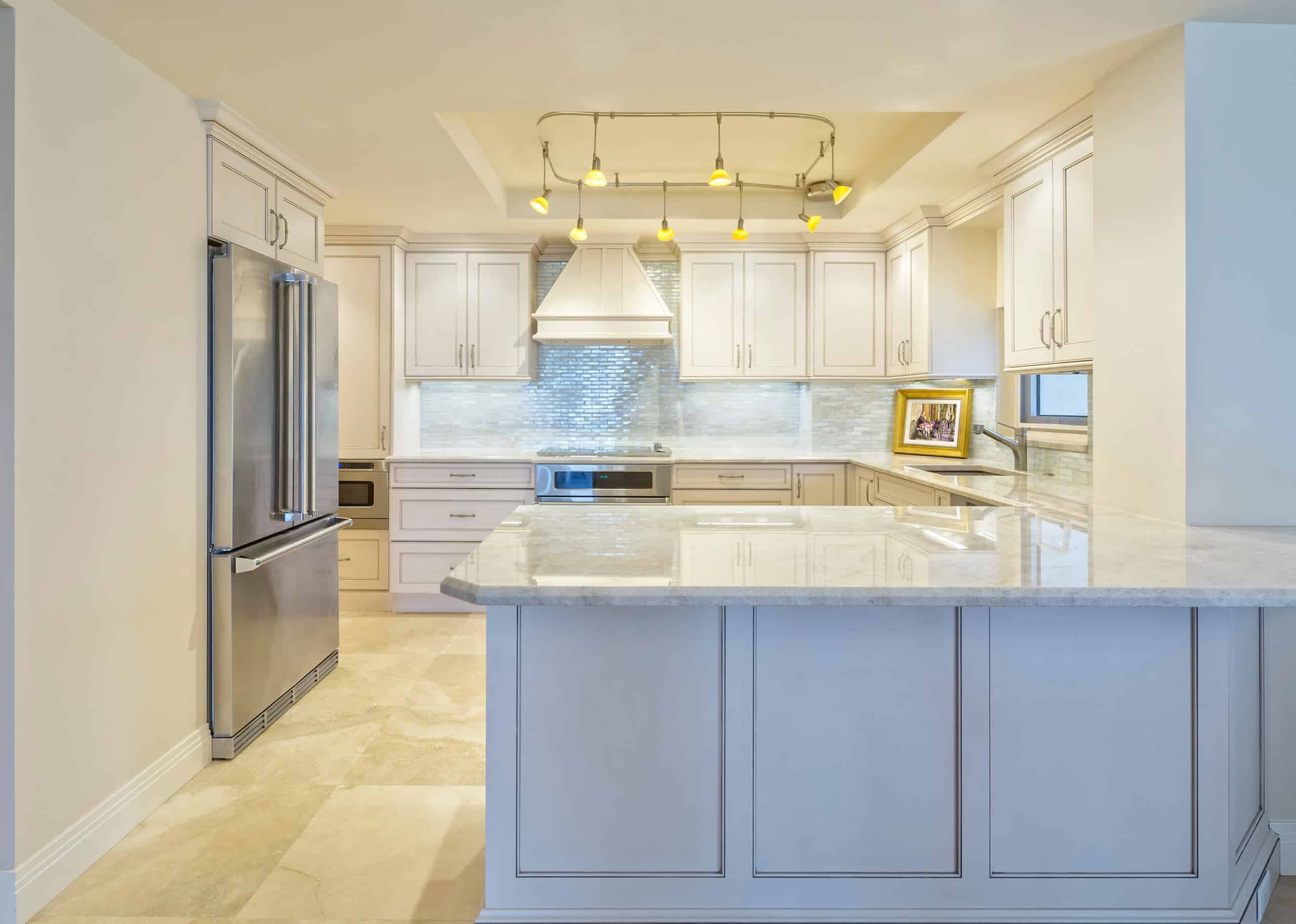
Spring colors for interior projects are making a strong comeback, especially for those planning interior house painting in Fort Collins, CO. With longer daylight, mild weather, and a natural urge to freshen up your space, spring is the ideal time to swap out dull walls for something that feels alive again. If you’re curious about what colors look best on spring walls, we’ve got five trending shades that bring charm, calm, and a seasonal lift to your home.
Key Takeaways
Why Fort Collins Homeowners Are Painting Now
Let’s face it—after a long winter, it feels good to refresh your space. And in Fort Collins, spring offers that perfect middle ground. You’re not battling extreme temperatures or dry indoor air that messes with how paint dries. Plus, with more natural light pouring in, now’s a great time to see how those colors look on your walls.

Another reason? Spring cleaning is already in full swing. So why go all in and treat your home to a full makeover?
5 Trending Colors That Bring Spring Inside
1. Cappuccino 2096-50 – Subtle Warmth with Personality
The cappuccino is light neutral and hints pink, giving it a soft, inviting vibe. It’s not too loud, not too bland. Just right. It adds a cozy feeling without taking over the room, perfect for living rooms, entryways, or even a mellow-toned nursery. Pair it with warm metallics like brass or copper to subtly pop the pink tones. It also works beautifully alongside natural textures like wood and linen, effortlessly blending into classic and modern interiors.

2. Fernwood Green 2145-40 – A Mossy Green with Fresh Vibes
Fernwood Green checks the box if you want something that feels peaceful but not sleepy. It’s slightly warm, which gives it a lived-in, welcoming feel. This one’s a hit in kitchens, offices, and anywhere you want to feel connected to nature. It plays well with natural wood finishes and matte black hardware, mixing classic with modern. If you feel playful, Fernwood Green also makes a great pairing with soft neutrals or even dusty pink accents. If your space gets good natural light, this green will shift beautifully throughout the day.

3. White Down OC-131 – Creamy, Clean, and Flexible
You really can’t go wrong with a soft off-white. White Down shade brings an easygoing look to any room and works beautifully across different finishes. Want a bit of visual interest without the drama? Try matte on walls, eggshell on the ceiling, and satin on the trim. White Down leans warm, making it more inviting than stark White. It’s great for homes with lots of cool northern light or open layouts where you want one color to tie the whole space together. Think of it as your dependable go-to for a soft, airy feel.

4. Simply White OC-117 – A Favorite for a Reason
Not all whites are created equal. Simply White is that off-white that plays well with cool and warm tones. It’s bright without being blinding. If you pair it with stronger wall colors, this color works for the entire room or just the trim and ceilings. It’s especially great for homes with modern trim, clean lines, and a minimalist aesthetic. Want to highlight architectural details like crown molding or wainscoting? Simply White will give you contrast without stealing the show. It’s one of those rare whites that stays consistent in almost any light.

5. Weston Flax HC-5 – A Sun-Touched Yellow with Character
This buttery yellow feels like spring sunshine on your walls. It works well in spots that could use more light—think hallway, laundry room, or even a kids’ play area. It’s cheery but soft, which makes it super flexible. Weston Flax hits the sweet spot if you’re after a color that feels warm but not too golden. It pairs nicely with crisp whites and soft grays and can be grounded with rustic wood or light blue accents. The vibe is upbeat and cozy—great for spaces where you want a little lift without overwhelming the room.

Choosing Spring Colors for Interior Updates
Choosing the right spring colors for interior house painting projects isn’t always simple. Fort Collins homes range from modern open-concepts to cozy craftsman-style bungalows, and not every trend fits every space. That’s why sampling paint in your lighting is key.
Paint swatches differ depending on the time of day, furniture, and floor color. Our advice? Sample your top picks in multiple spots around the room and check them during different times of the day.
If you still feel stuck, professional interior house painters can offer in-person or virtual color consultations to help you decide.

Why Spring House Painting Makes Sense
We’re often asked if spring is really the right time for interior house painting—and the answer is yes. Spring offers longer days, less humidity, and the proper air circulation for paint to cure evenly. That means faster results and a smoother finish.
On top of that, spring schedules tend to be more open than summer, when vacation and family events pack the calendar. So, if you’ve been putting off your spring house painting, now’s the time to make it happen.
Ready to Refresh Your Home This Spring?
This is your sign if you’ve been thinking about interior house painting in Fort Collins, CO. A little color can shift the mood of your home, and spring is the perfect time to make that change.
Foothills Painting is your local, professional painting team serving Fort Collins, Broomfield, Arvada, and surrounding areas. We’ve helped hundreds of homeowners bring new life to their spaces with expert prep, a sharp eye for color, and quality you can feel.
Call us today at 970-427-2866 for a FREE estimate, and let’s get your home ready for the season!


