
Living room paint colors can look very different once they move from a sample card to a full wall. Window direction, flooring, furniture, fireplaces, artificial lighting, and paint sheen can all change how a color appears throughout the day.
Boulder homes often have large windows and strong natural light, which makes color testing especially useful. Instead of choosing from a store display alone, compare each sample in the actual room before approving the full project.
Key Takeaways:
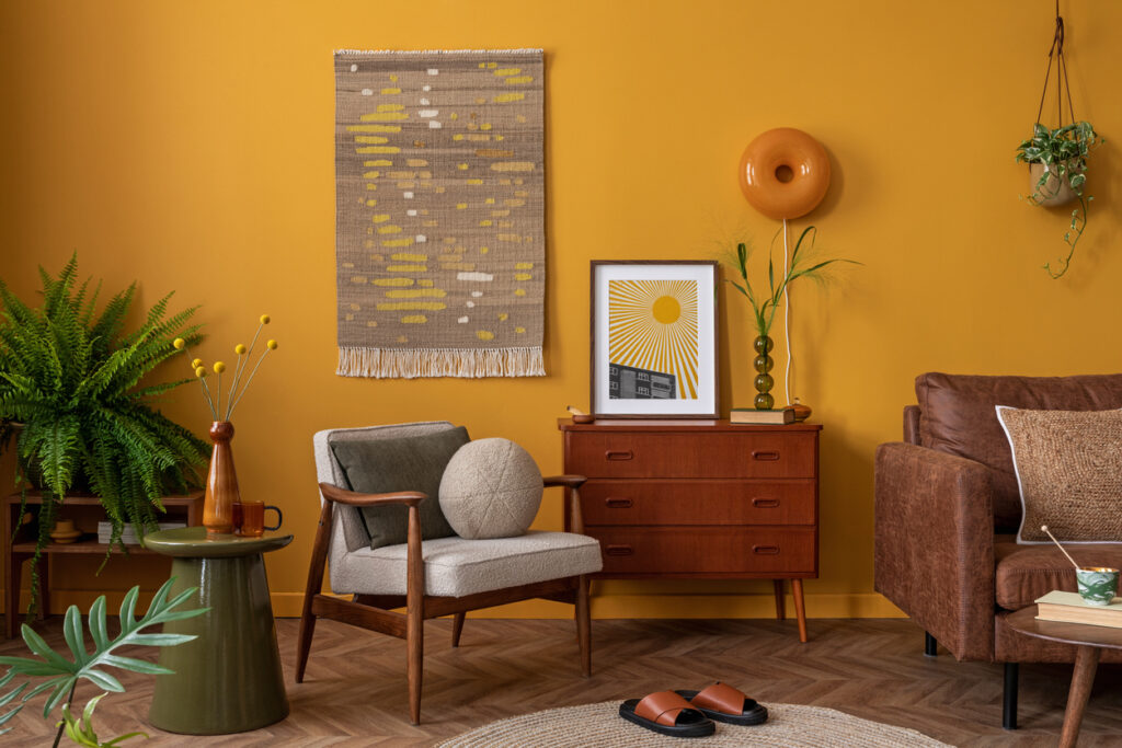
Why the Same Color Looks Different From Room to Room
A paint color is affected by every surface around it. Warm wood flooring can make beige, green, or cream undertones easier to see. Cool stone, gray furniture, or bright white trim can make the same wall color appear warmer by comparison.
Window direction also changes the look. South-facing rooms often receive more direct light for longer periods, while north-facing rooms usually receive softer light. East-facing rooms change after the morning sun passes, and west-facing rooms may become much warmer later in the day.
Trees, porches, neighboring buildings, window coverings, and glass tint can change those patterns. Room direction is a starting point, not a rule that tells you which color to buy.
This article about how paint color changes while drying also explains why wet paint, dry paint, sheen, and lighting should not be judged the same way.
Choose the Finish Along With the Color
Sheen affects how much light reflects from the wall. That reflection can change how bright a color appears and how visible drywall texture or patches become.
Eggshell is a common living room choice because it offers a soft amount of reflection. Washable matte may work well on walls with minor texture, while satin may fit spaces that need more frequent cleaning.
Do not choose by sheen name alone. Paint companies formulate their products differently, so one matte product may clean differently from another.
Foothills Painting’s guide to satin and matte paint finishes explains how reflectivity, cleaning, and wall condition affect the decision.
7 Living Room Paint Colors to Test in 2026
1. Warm White
Sherwin-Williams Alabaster SW 7008 and Benjamin Moore White Dove OC-17 are useful starting points for homeowners who want a light wall without a stark white appearance.
Warm whites can work well with wood floors, stone fireplaces, cream fabrics, and natural materials. They may look more yellow beside cool white trim or blue-gray flooring, so compare the sample with the fixed finishes.
2. Universal Khaki SW 6150
Sherwin-Williams selected Universal Khaki SW 6150 as its 2026 Color of the Year. It is a warm neutral that sits deeper than an off-white or light greige.
This color can pair with cream upholstery, wood, black accents, leather, and warm stone. In a room with limited daylight, it may appear heavier than it does on a sample card.
3. Soft Sage Green
Soft sage can bring color into a living room without the weight of a dark green. Sherwin-Williams Evergreen Fog SW 9130 and similar muted greens are good starting points.
Green undertones interact strongly with wood, stone, beige, and red-toned flooring. Compare the sample against those materials so the room does not pick up an unwanted yellow or gray cast.
4. Warm Greige
Warm greige combines gray and beige, but the balance changes from one color to another. Sherwin-Williams Accessible Beige SW 7036 and Benjamin Moore Edgecomb Gray HC-173 are two examples worth testing.
These colors can support wood floors, light stone, neutral upholstery, and open floor plans. Some greiges lean green, pink, purple, or yellow when placed beside other finishes.

5. Soft Clay
Clay and muted terracotta colors add warmth without reaching the intensity of a bright orange or red. They can work especially well with cream trim, natural wood, leather, and woven fabrics.
These shades tend to become stronger under warm afternoon sun and warm evening bulbs. A lighter clay may be easier to use throughout a room, while a deeper version may work better on one wall or a smaller connected area.
6. Deep Blue
Benjamin Moore Hale Navy HC-154 and Sherwin-Williams Naval SW 6244 are examples of deep blues that can add contrast to a living room.
Dark blue works best when the room has enough lighting and clear contrast from the ceiling, trim, flooring, and large furniture. It may be used on every wall or limited to an accent area.
7. Mushroom or Warm Taupe
Mushroom and warm taupe sit between beige, brown, and gray. They can provide more depth than a light greige while staying quieter than green, blue, or clay.
These colors pair well with natural wood, cream upholstery, charcoal accents, and stone. Compare several samples carefully because taupe can shift toward pink, purple, green, or yellow depending on the flooring and light.
Artificial Lighting Changes Wall Color Too
Natural light is only part of the decision. After sunset, lamps, recessed lights, and decorative fixtures become the main light sources in the room.
The U.S. Department of Energy explains that lower color temperatures produce warmer, more yellow light, while higher color temperatures produce cooler, bluer light. Its guide to light bulb color temperature shows why a wall color can look different after the lamps come on.
Test samples under the bulbs you actually plan to use. Changing from warm bulbs to cooler bulbs after painting can make the same wall color feel different at night.
How to Test Living Room Samples
A small sample card is useful for narrowing the list, but it should not be the final test.
Preparation Still Affects the Final Color
A good color can still look uneven when the wall has patches, stains, glossy areas, dents, or poorly blended repairs.
Primer may be needed on bare drywall, patched areas, stains, or major surface changes. It is not required in every situation.
Foothills Painting’s guide to when paint primer is needed explains how primer affects absorption, adhesion, and coverage.
The number of finish coats also depends on the starting color, selected color, primer, product, sheen, and wall condition. Review this article about how many coats a wall may need before assuming one or two coats will work for every color.
Open Living Areas Need a Color Plan
Many living rooms connect directly to kitchens, dining rooms, hallways, and stairwells. That does not mean every connected area needs the same wall color.
A consistent plan can use one main neutral with a related accent color, or several colors that share similar undertones. Look at sightlines from the living room into nearby areas before approving the final palette.
Frequently Asked Questions
What finish works best on living room walls?
Eggshell is a common starting point, but washable matte and satin can also work. The right choice depends on cleaning needs, wall condition, lighting, and the exact paint product.
Do dark living room colors make the room feel smaller?
They can make walls feel heavier in some rooms, but lighting, ceiling color, furniture, and contrast also affect the result. Testing the color in the room is more useful than relying on one rule.
Should the living room and kitchen use the same color?
They can, but they do not have to. Connected spaces can use related colors as long as the undertones, trim, flooring, and sightlines work together.
Should paint samples be placed directly on the wall?
They can be, but removable sample boards also work well. Boards make it easier to move the same color between walls and compare it with flooring, furniture, and trim.
Test the Color Before Painting the Full Room
Living room paint colors work best when they are selected with the room’s natural light, artificial lighting, flooring, furniture, trim, and wall condition in mind. A sample that looks right in the store still needs to prove itself inside the home.
Foothills Painting provides interior house painting services in Boulder and throughout the Northern Colorado and Denver Metro area. Its current interior service page lists free in-home estimates, color consultation support after estimate approval, surface preparation, furniture and floor protection, cleanup, and a final walkthrough.
Contact Foothills Painting at 970-427-2866 to schedule a free estimate and review color, sheen, preparation, and coating options for your living room.